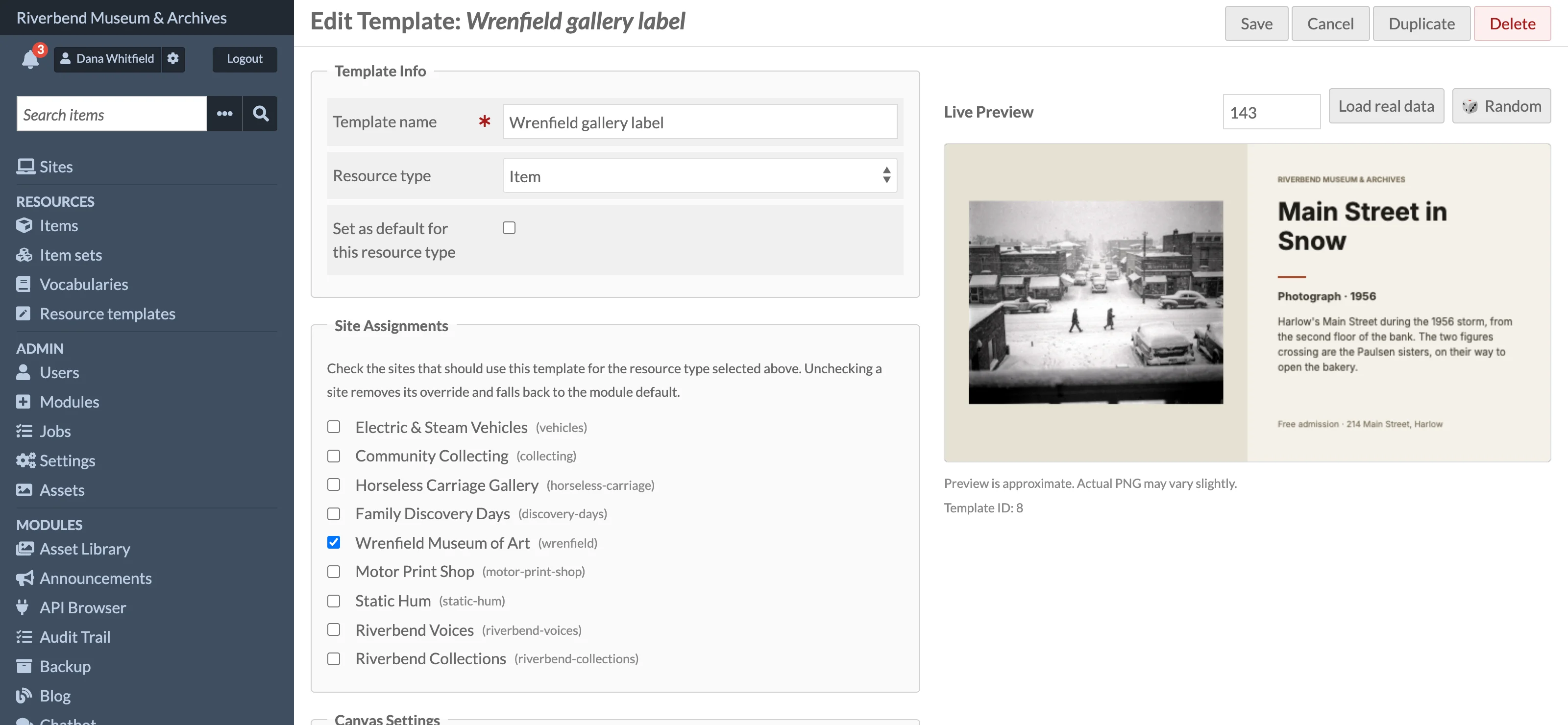
The template editor on the add and edit pages has two panes: settings and layers on the left, a live canvas preview on the right. Everything you change is reflected in the preview after a short delay. The preview is drawn by your browser with the same fonts and rules as the server, so the PNG matches it closely; fades and blurs can differ very slightly.
Style presets
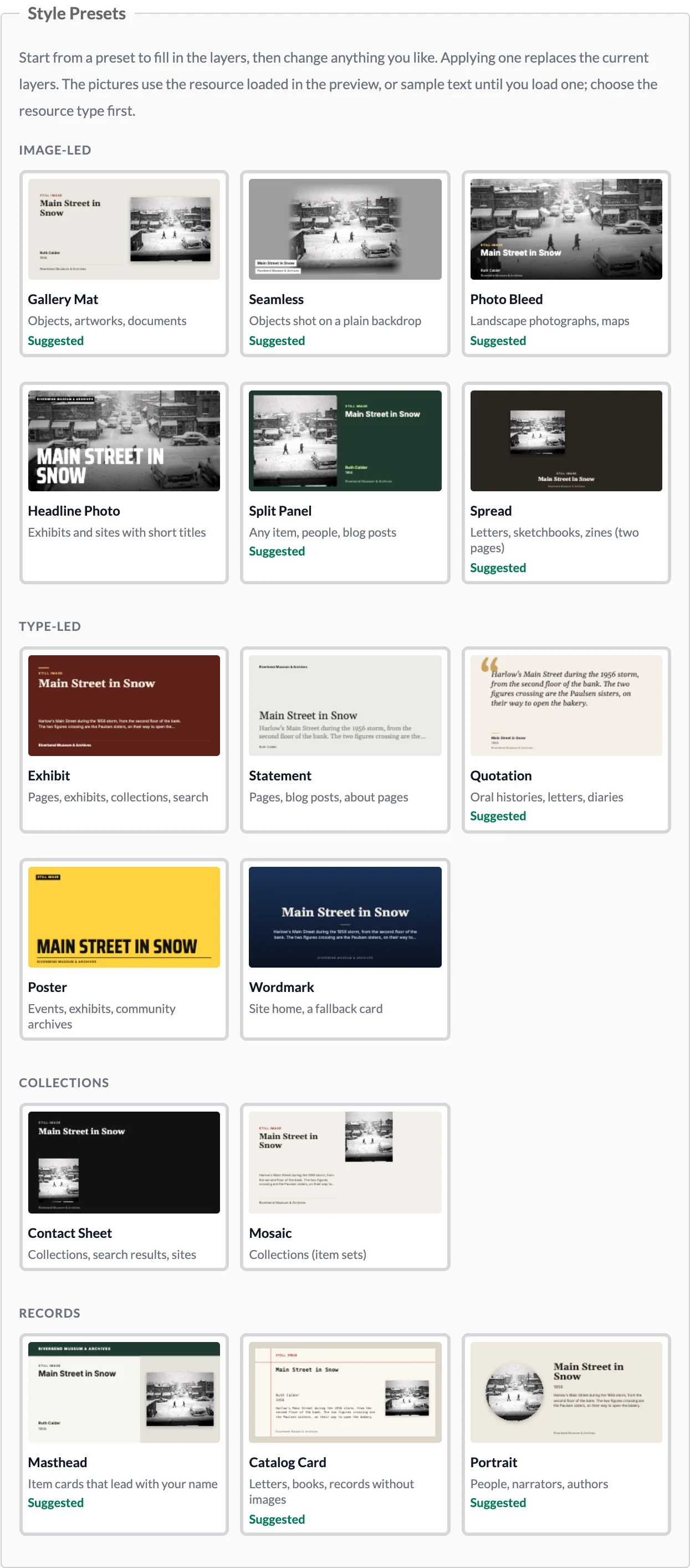
The Style Presets section offers sixteen starting points in four groups, each drawn as a small picture of the card it makes. Until you load a resource in the preview the pictures use sample text and grey stand-in images; after you load one (see Previewing with real data below) they show that resource, so you can compare the presets with your own content.
Clicking a preset replaces all current layers (you are asked to confirm if the template already has layers) and sets the background colour. Its placeholders are swapped for the variables of the selected resource type, so choose Resource type first, then apply the preset. Presets that suit the selected type are marked Suggested. A preset that needs more pictures than the type provides (two pages for Spread, four images for Contact Sheet and Mosaic) is dimmed with a note; you can still apply it and fill in the image sources yourself.
| Group | Preset | Suits |
|---|---|---|
| Image-led | Gallery Mat | Objects, artworks and documents: the whole image on a mat, never cropped, with a serif title. |
| Seamless | Objects photographed on a plain backdrop: the card takes the backdrop's colour and the object floats in it, with small labels. | |
| Photo Bleed | Landscape photographs and maps: the photo fills the card and darkens towards the title. | |
| Headline Photo | Exhibits and sites with short titles: a photo behind a very large condensed title. Long titles are cut short. | |
| Split Panel | Any item, people, blog posts: a framed photo beside the title. | |
| Spread | Letters, sketchbooks and zines: the first two pages side by side. | |
| Type-led | Exhibit | Pages, exhibits, collections and searches: a large serif title on a deep colour. |
| Statement | Pages, blog posts and about pages: a quiet serif title with the excerpt or tagline beneath. | |
| Quotation | Oral histories, letters and diaries: the description as a large quotation. | |
| Poster | Events, exhibits and community archives: bold condensed capitals on a bright colour. | |
| Wordmark | The site home page, or a fallback card: the site's name and tagline centred, with its logo if it has one. | |
| Collections | Contact Sheet | Collections, search results and sites: the title above a row of four images. |
| Mosaic | Collections: the title beside a grid of four images. | |
| Records | Masthead | Item cards that lead with your institution's name in a band across the top. |
| Catalog Card | Letters, books and records without strong images: a typed library catalog card. | |
| Portrait | People, narrators and authors: a round portrait with their name, dates and description. |
The collection presets use the first four items with images (for an item set), the newest items (for a site) or the first matching items (for a search); see Template Variables.
Layers
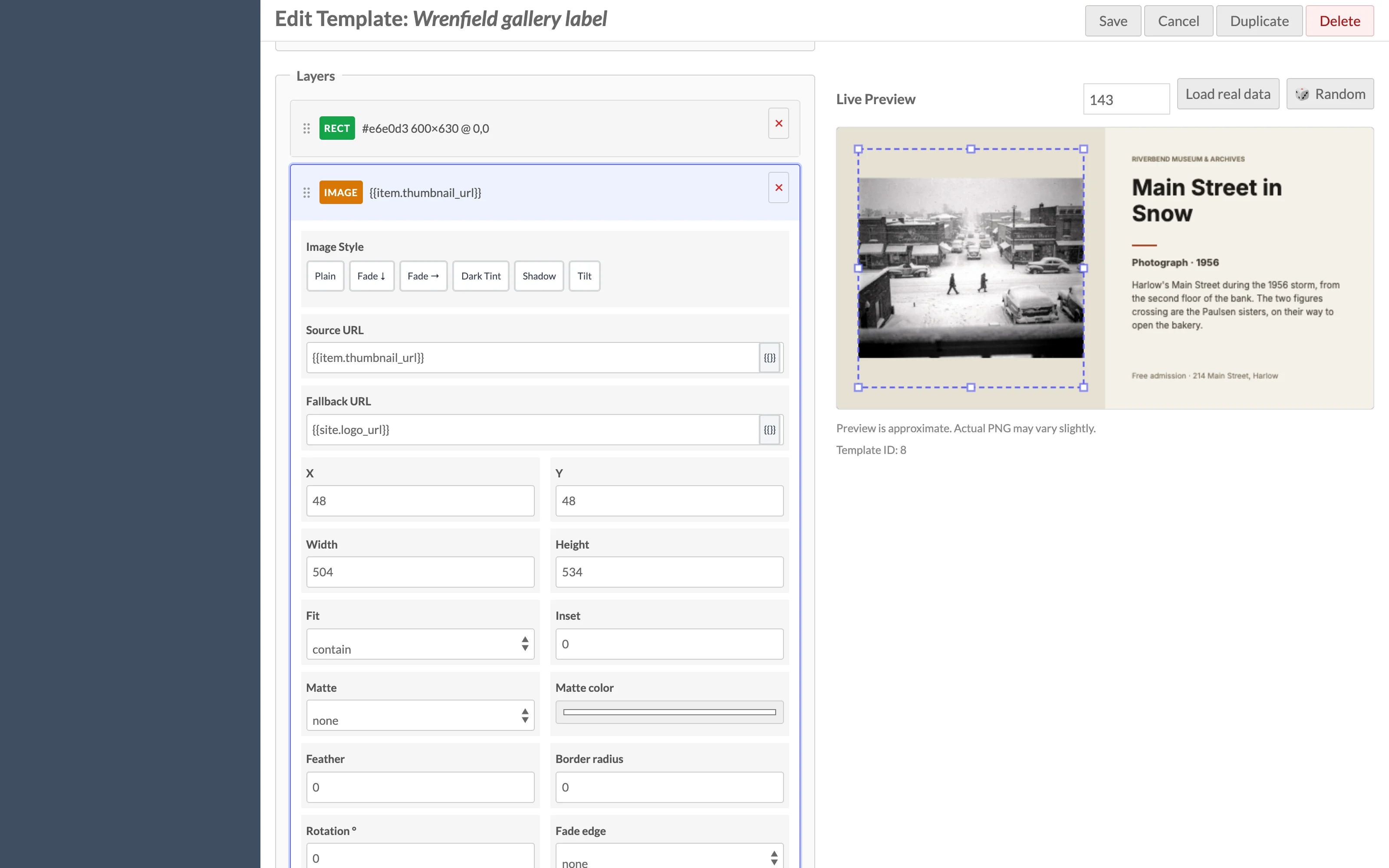
Layers are drawn in list order, first at the bottom. Add a layer by choosing a type next to + Add Layer and clicking the button. Drag the handle on the left of a layer to reorder it. Click a layer header to expand its fields and select it on the canvas; click the x to remove it.
| Layer type | Fields |
|---|---|
| Text | Content, X, Y, Font size, Weight, Font, Style, Color, Max width, Max lines, Line height, Align, Y is the, Letter spacing, Label background, Label color, Label padding |
| Rectangle | X, Y, Width, Height, Color, Opacity, Gradient, Gradient to, End opacity |
| Line | The same as a rectangle (a line is drawn as a filled rectangle) |
| Image | Source URL, Fallback URL, X, Y, Width, Height, Fit, Inset, Matte, Matte color, Feather, Border radius, Rotation, Fade edge, Fade color, Fade strength, Tint color, Tint opacity, Shadow color, Shadow blur, Shadow X, Shadow Y |
Positions and sizes are in canvas pixels.
Text
Text wraps to Max width; lines beyond Max lines are dropped and the last visible line is trimmed with an ellipsis. Font size is in pixels.
- Font is one of the bundled families: Inter (sans serif), Gelasio (serif), Saira Condensed (condensed capitals for headlines) and DejaVu Sans Mono (typewriter). Weight
bold,700,800or900uses the family's bold face; anything else its regular face. Styleitalicuses Gelasio's italics; the other families have none and stay upright. - Align places each line at the left, centre or right of Max width.
- Y is the says whether Y is the top, middle or bottom of the text. With bottom, a title that wraps onto more lines grows upwards, so it never runs into what is below it.
- Letter spacing adds pixels between letters, for small capital labels.
- Label background
soliddraws a box of Label color behind each line, Label padding pixels larger than the capital letters, so text stays readable over a photo.
Rectangles and lines
Opacity runs from 0 (invisible) to 1 (solid). Set Gradient to down or right to blend from Color at Opacity to Gradient to at End opacity. A black rectangle from opacity 0 to 0.85 over the bottom of a photo darkens it behind white text.
Images
- Fit is
cover(crop to fill the box),contain(show the whole image inside the box) orfill(stretch). - Inset leaves that many pixels between the box's edge and the image.
- Matte fills the box behind the image:
colorwith Matte color, orautowith the colour around the image's own edge, which suits objects photographed on a plain backdrop. - Feather fades the image's edges to transparent over that many pixels, so a matted photo blends into its backdrop.
- Border radius rounds the corners; a radius of half the box's width makes a square box a circle.
- Fallback URL is used when the source resolves to an empty value, for example an item with no thumbnail.
Image styles
Each image layer has quick-apply buttons: Plain, Fade ↓, Fade →, Dark Tint, Shadow and Tilt. They fill in the effect fields, which you can then fine-tune:
- Fade edge, colour and strength draw a gradient from one edge of the image.
- Tint colour and opacity lay a translucent colour over the image.
- Rotation turns the image by the given degrees about its centre; the corners are not cut off.
- Shadow color, blur and offsets draw a drop shadow that follows the image's shape: a contained picture, a circle or a rotated image casts a shadow of that shape. Shadow color takes
rgba(r,g,b,a). On the server the blur needs the Imagick extension; without it the shadow is drawn without blur.
Variables
Text content, image source and fallback fields accept {{variable}} placeholders that are filled with the resource's metadata at render time. Click the {{}} button next to a field to pick from the variables available for the selected resource type. Filters such as {{item.description | truncate(120)}} can be appended. See Template Variables for the full list.
Working on the canvas
- Click a layer on the preview to select it. The matching entry in the layer panel expands.
- Drag a selected layer to move it.
- Drag the corner and edge handles to resize a rectangle, line or image. For text layers the horizontal handles change Max width and the vertical handles change Max lines.
- With a layer selected and focus outside a form field, use the arrow keys to nudge it by 1 px, or Shift + arrow for 10 px. Press Escape to deselect.
Previewing with real data
The preview initially renders with empty variables. To see real content:
- Choose the Resource type.
- Enter a resource ID in the Resource ID box and click Load (on the add page) or Load real data (on the edit page), or click Random to pick a random resource of that type.
The preset pictures are redrawn with the loaded resource too. Changing Resource type clears the loaded data. The Random button does not support the Search type. Preview data is loaded without a site context, so {{site.title}} shows the installation title rather than a specific site's title.
Raw JSON
Click Toggle raw JSON to show the Layout JSON textarea. The layer panel and the JSON stay in sync in both directions, so you can paste a layout, hand-edit a value the fields do not expose, or copy the JSON to another template. Invalid JSON is rejected on save with "Layout JSON must be valid JSON." See Layout JSON for the format.