Settings in Colors & fonts and Dark mode.
Color palette
| Palette | Colors |
|---|---|
| Sunshine | Orange, sunny yellow and teal on a cream page |
| Bubblegum | Raspberry, grape and aqua on a soft pink page |
| Ocean | Blue, sea green and coral on a pale blue page |
| Meadow | Leaf green, sky blue and sunflower on a pale green page |
The palette's main color fills the header (unless you choose another Header › Header color), buttons and links; its second color fills the footer; its third color fills the announcement bar. The decorations use all three. Where text in a color, or on a color, would be hard to read, Confetti darkens or lightens that color just enough, keeping its hue, so every pairing meets WCAG 2.2 AA.
Fonts
| Setting | Choices |
|---|---|
| Heading font | Fredoka (default): round and bubbly. Baloo 2: chunky and cheerful. Nunito: soft and rounded. |
| Text font | Nunito (default): soft and rounded. Andika: designed for children learning to read. Atkinson Hyperlegible Next: designed for low-vision readers. |
The fonts are included with the theme and served from your own site.
Decorations
| Choice | What you see |
|---|---|
| Playful (default) | Confetti dots on the banner and in the footer, a squiggle under page titles, stars beside the site's name and the announcement, wavy link underlines on hover |
| Calm | The same rounded shapes, colors and wavy edges, without the extras |
Decorations are pictures only: they never carry text, and they stay out of the way of screen readers.
Dark mode
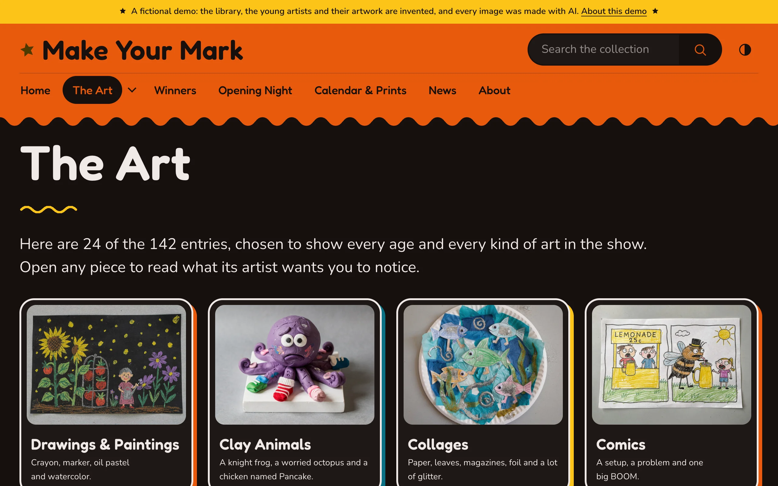
| Choice | What visitors see |
|---|---|
| Follow each visitor's device, with a light/dark switch (default) | The dark "night" version when the device is set to dark, and a switch in the header |
| Light by default, with a light/dark switch | The light version, and a switch |
| Always dark | The night version |
| Light only | The light version |
The night version is made from your palette and checked for contrast the same way. If your logo is dark, add a light version under Logo for dark mode.