Cards
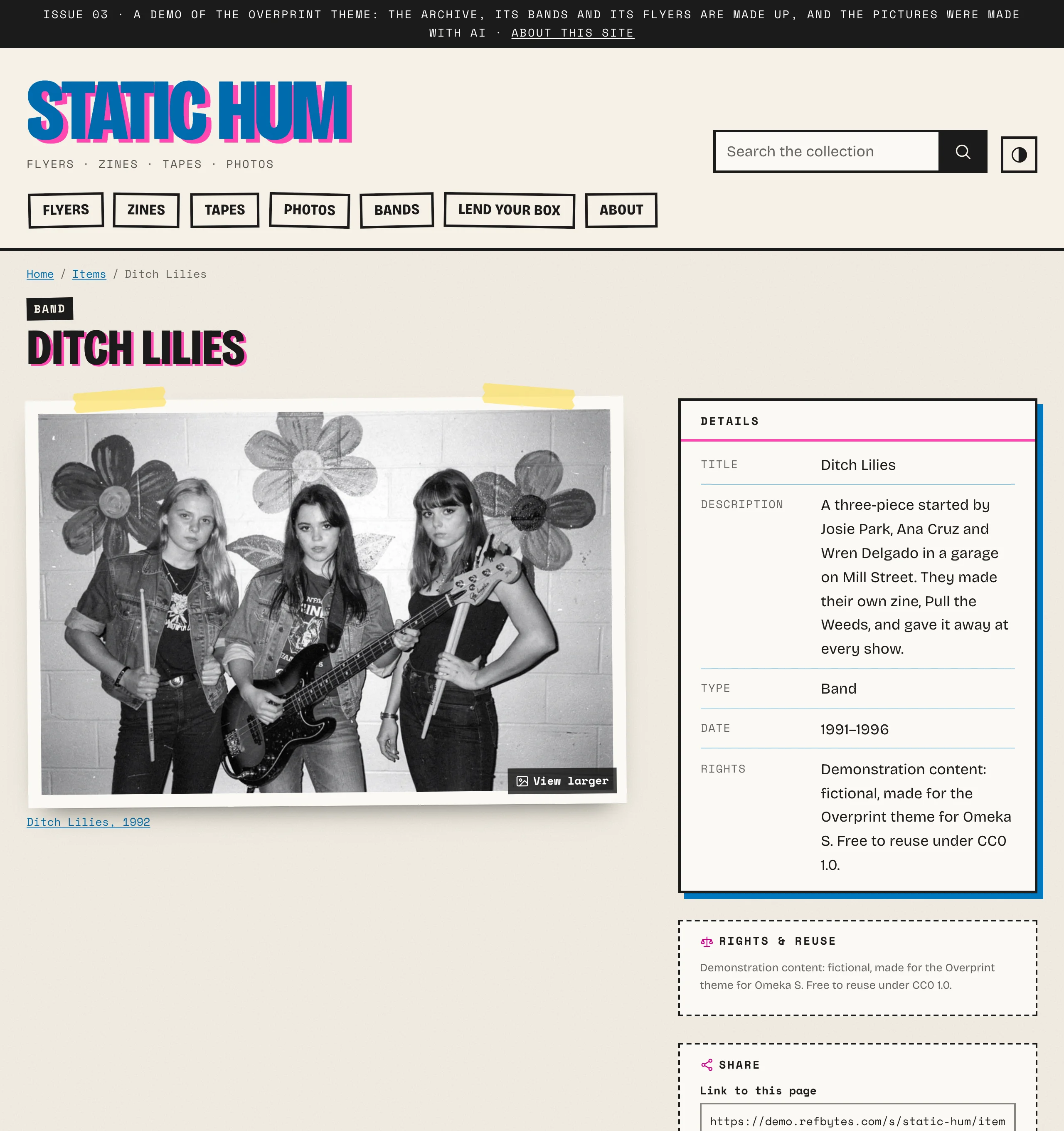
Browse pages, browse previews and linked items show items as cards pasted on the page: the picture inset like a photo on a card, a sticker for what the item is, its date, and its title.
| Setting | Choices |
|---|---|
| Line under the card title | Type and date (the default): the item's Type as a sticker, such as FLYER or ZINE, then its date. Class and date: the item's class as the sticker. Creator and date, Date only, or Nothing. |
| Description on cards | In list view only (the default): in a grid, cards are pictures with a title, like a wall of flyers; in list view each row has room for three lines. Or the first three or five lines, the full description, or none. |
| Card image shape | Original proportions (most presets): each picture whole, so cards in a row end at different heights, like a bulletin board. Or landscape, square, portrait or wide, cropped or whole (Card image fit). |
| Card size, Default layout, Let visitors switch | How many cards per row on a wide screen; a grid or a list; a grid/list switch for visitors |
The type is the item's Type value (dcterms:type), such as "Flyer", "Zine", "Cassette", "Photograph" or "Band"; an item without one shows its class (such as "Still Image") instead. The same word sits above the title on the item's own page.
In list view, cards stack straight, like index cards, with the picture to the side.
Item pages
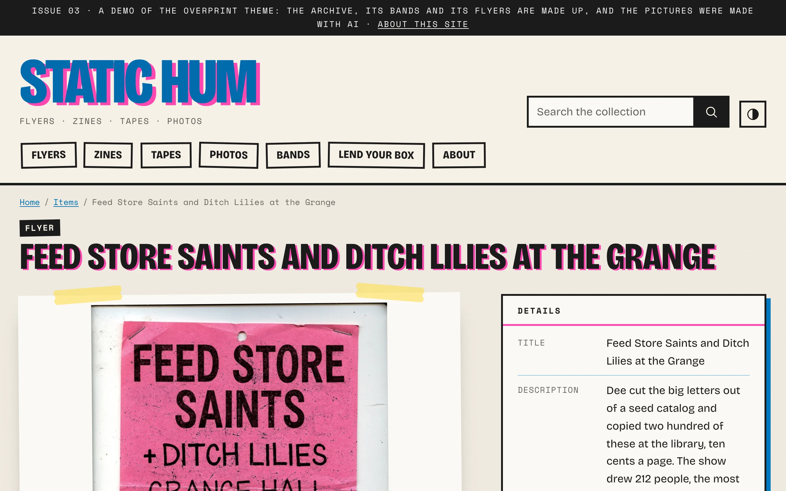
Overprint starts item pages from its own arrangement (Theme › Configure resource pages):
| Region | Blocks |
|---|---|
| Main column | Media gallery: the picture, large, taped down on the page; more images as thumbnails |
| Sidebar | Values, headed "Details", as an index card; Subject links ("Filed under", as stickers); Rights & reuse; Share |
| Bottom | Linked items as cards, Cite this, Item sets, Site pages, Previous and next in collection |
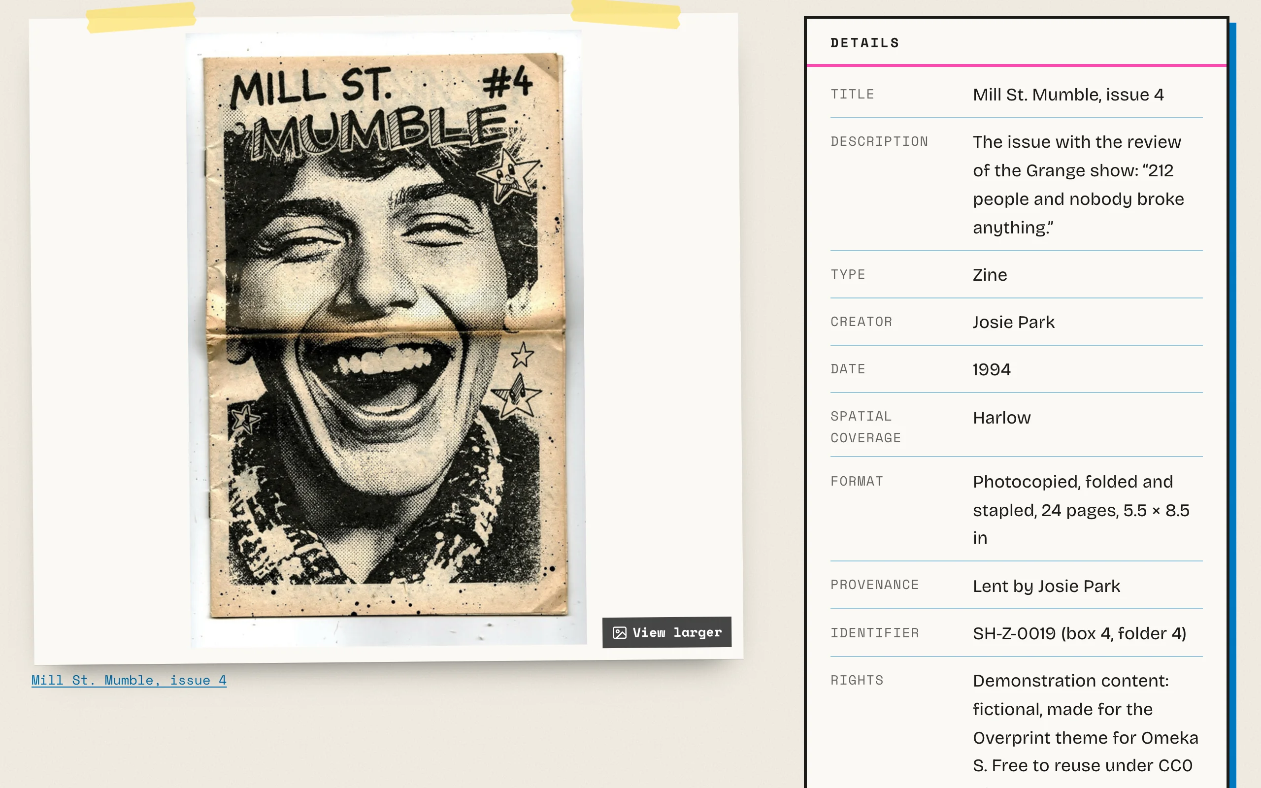
The details card lists every value with its property's name in the label font, between ruled lines. Rights & reuse, Share and Cite this are cut-out coupons with dashed edges. Item & media pages › Page layout puts the sidebar on the right (the default) or the left, or below.
People, bands and groups
Give each band, artist or group an item of its own, with the class Group or Person, a Type such as "Band", its years as its Date, a short history as its Description and, if you have one, a photo as its media. Link the items about them to that item, as Creator (a band's tape) or Subject (a flyer or photo of the band). The band's page then lists everything about it under Linked items, grouped by property, and the flyer's page files it under the band.