Overprint's look comes from a style preset, its ink and paper settings, and colors and fonts. Settings left at "Use preset" follow the preset; choose a value of your own and it stays yours when you switch presets.
Presets
| Preset | Look |
|---|---|
| Pink & Blue | Fluorescent pink over blue on cream paper; the masthead; a little crooked and taped; hero banners in two inks |
| Red & Teal | Bright red and teal, a loud gig poster: the inks slip further, and cards print in two inks too |
| Sunflower & Federal Blue | A calm community newsletter: federal blue and sunflower on warm white, Atkinson Hyperlegible Next for text, a centered nameplate, everything straight, original colors |
| Orange & Purple | Fluorescent orange and purple for a late-night radio zine; a slim header bar; straight and taped; cards in two inks |
| Photocopy | Black toner on white copier paper, a gray smudge for the second ink, and typewritten text in Space Mono |
Ink and paper
| Setting | Choices |
|---|---|
| Misregistration | How far the second ink slips out from behind the masthead, page titles, buttons and pictures. None lines the inks up; Slight shows a sliver; Loud is a bold offset. Text itself always prints in one solid, readable color. |
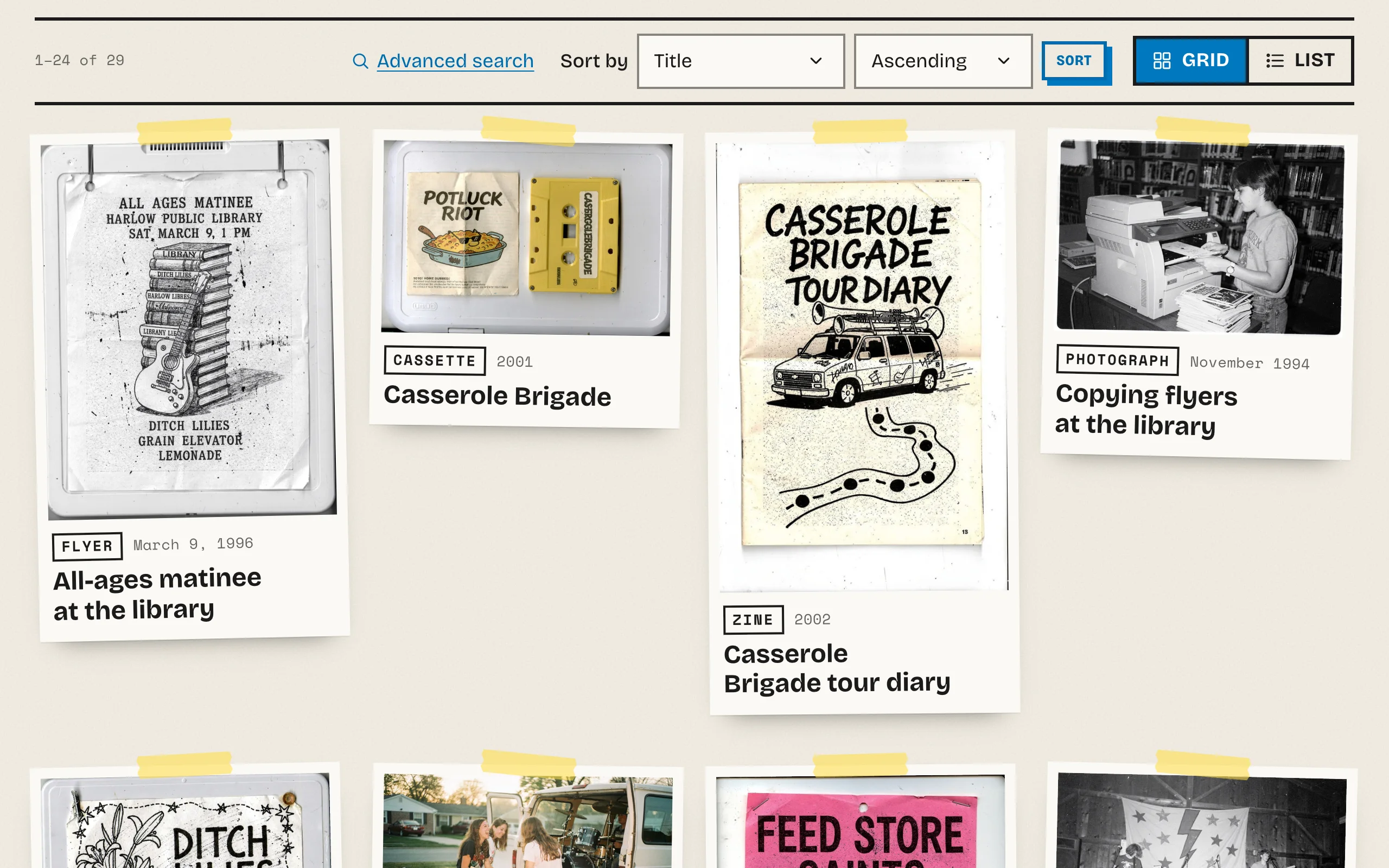
| Paste-up | Tidy: straight, no tape. Taped: straight, held down with tape. Pasted: a little crooked, held down with tape. Applies to cards, pictures on item pages, stamped menu labels, stickers, pull quotes and card blocks. |
| Pictures printed in two inks | None: original colors everywhere. Hero banners only. Hero banners and cards: browse cards print in two inks too, and show the original when a visitor points at a card or tabs to it. Item pages always show the original picture. |
| Paper | Plain, or Grainy, like newsprint: a faint texture across the page. |
| Labels and small print | Typewriter (Space Mono) for dates, captions, field names, breadcrumbs and the announcement bar, or Same font as the body text, which reads more easily in long lists. |
Colors: the inks
Overprint prints with the palette's colors as inks:
- Accent color: the first ink, the one that slips. Fluorescent pink in Pink & Blue. It also fills the current menu label and stickers, with text in a color that reads on it.
- Primary color: the second ink. The dark parts of two-ink pictures print in it, and it fills buttons and colors links.
- Secondary color: the black key plate of the announcement bar and the footer in most presets.
- Page background: the paper. Text color: the ink of the text.
Link color and Heading color pick from them. Overprint adjusts any pairing that would fall below WCAG AA contrast, so every choice stays readable; the inks on their own only draw shadows, tape, stickers and pictures, never small text.
Dark mode
| Setting | Choices |
|---|---|
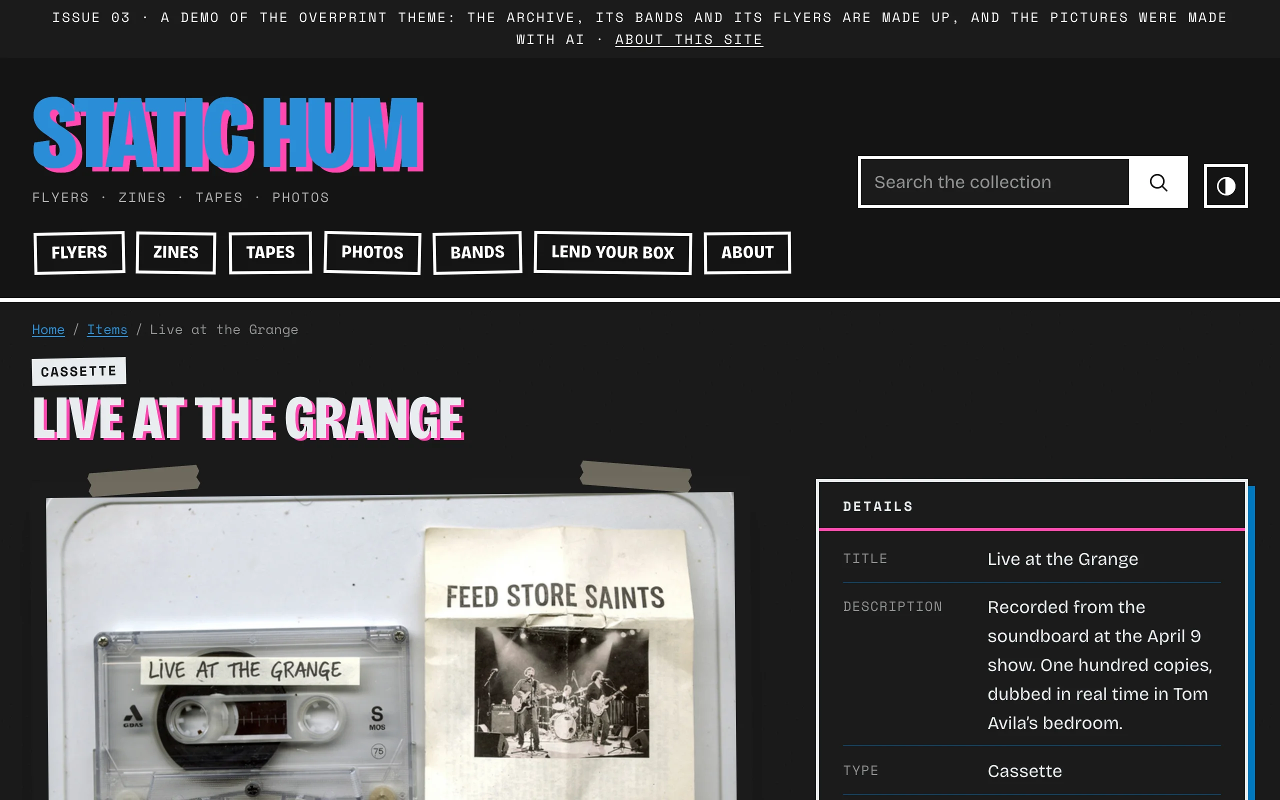
| Dark mode | Follow each visitor's device, with a light/dark switch · Light by default, with a light/dark switch · Always dark · Light only |
| Dark mode background | The paper in dark mode: the preset's near-black, or blank to derive one from the primary color |
| Logo for dark mode | A light version of your logo, shown on dark backgrounds |
In dark mode, two-ink pictures print the other way round: the light parts in the second ink on black paper.
Typography
| Setting | Choices |
|---|---|
| Heading font, Body font | Bricolage Grotesque, Space Mono, Atkinson Hyperlegible Next, or a system font |
| Font stylesheet, custom fonts | Your own fonts from a stylesheet URL (such as Adobe Fonts) |
| Base text size | 16 to 20 pixels; visitors' browser text size still applies |
| Heading size contrast | From subtle to dramatic |
| Heading weight | Regular to extra bold |
| Heading capitalization | All capitals (most presets) or as written (Sunflower & Federal Blue), for short headings |
| Link underlines | Standard, or a thin underline that thickens on hover |
Bricolage Grotesque narrows itself for the masthead, page titles and section headings, like a poster typeface; other fonts keep their width. The bundled fonts are served from your own site.
Layout
Maximum page width, Reading width, Button style (solid or outlined) and Spacing. Overprint's corners are square and its shadows are its own, so it has no corner, button shape or shadow settings.