Plinth's look comes from a style preset, how works are shown, and colors and fonts. Settings left at "Use preset" follow the preset; choose a value of your own and it stays yours when you switch presets.
Presets
| Preset | Look |
|---|---|
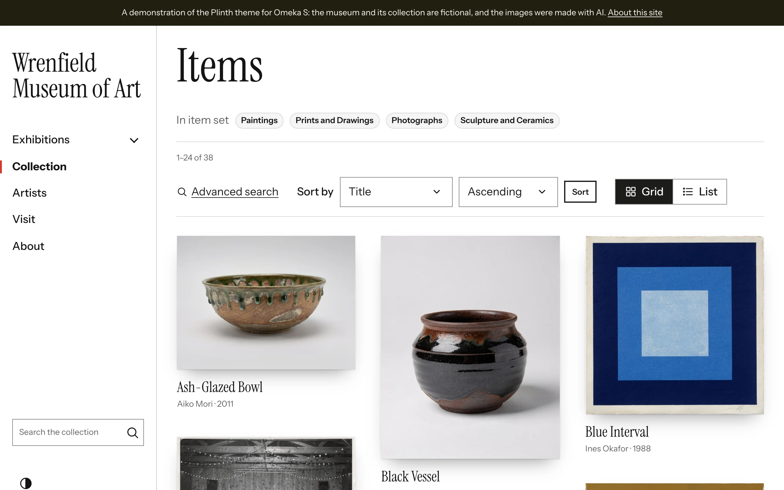
| White Cube | White walls, black type and a vermilion accent; Instrument Serif and Instrument Sans; the side rail; works hung with a soft shadow in staggered columns |
| Salon | Linen walls, oxblood and forest green; Cormorant Garamond and Newsreader; a top bar; works framed in walnut around a mat |
| Kunsthalle | Bold Archivo in capitals, black bars and electric blue; a dark top bar; flat works in even squares |
| Atelier | Warm paper, terracotta and olive; Newsreader and Instrument Sans; a tinted side rail; matted works |
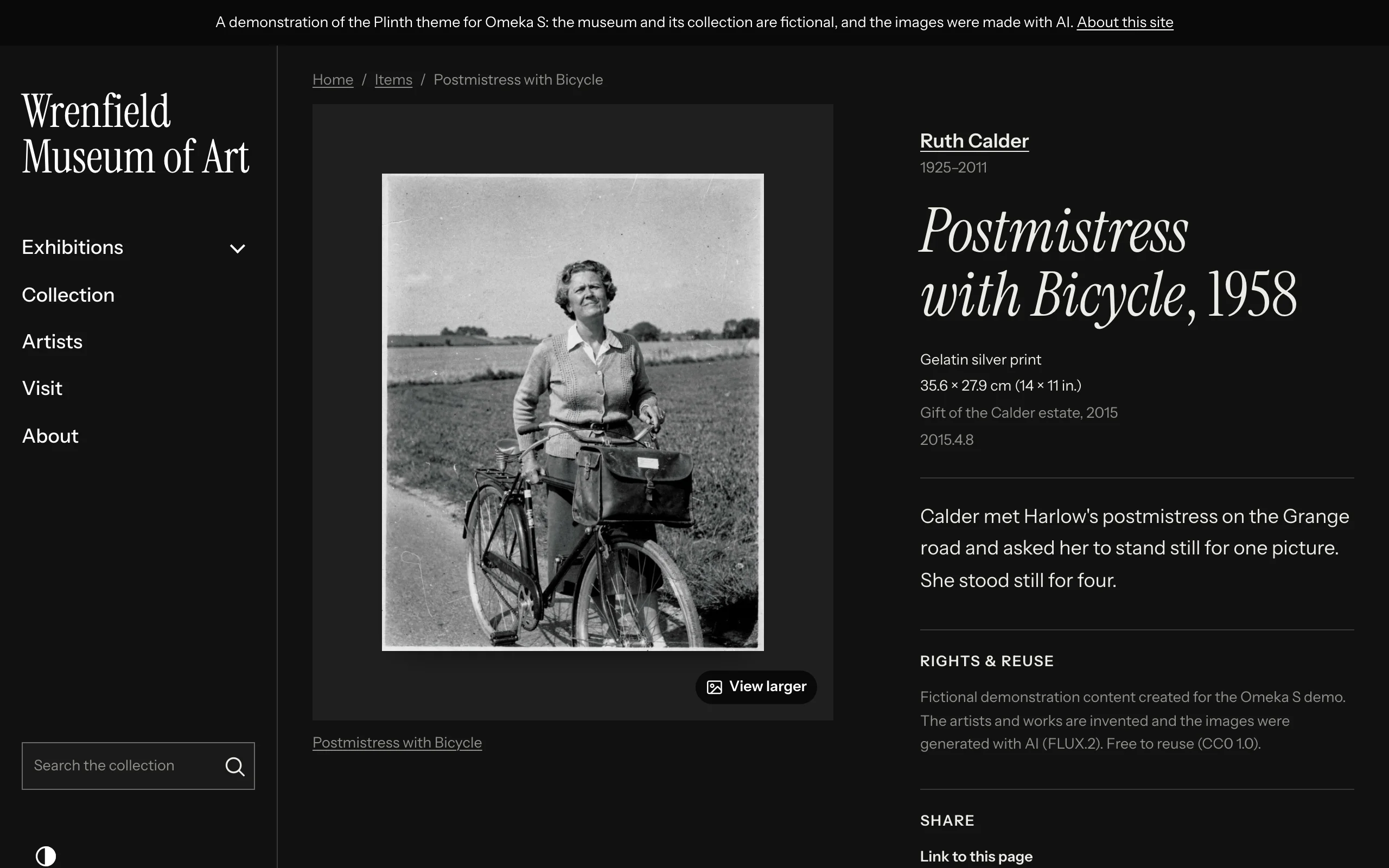
| Darkroom | Always dark, for photography; Instrument Sans; the bar over the image; flat works in rows of equal height |
Artworks
| Setting | Choices |
|---|---|
| How works are hung | Hung: a soft shadow on the wall. Matted: a pale border, like a print. Framed: a thin dark frame around a mat. Flat: the image alone. Applies to works in grids, on item pages and in item blocks; image cards (asset blocks) are left as they are. |
| Grids of works | Staggered columns: works stack in columns at their own shape. Rows of equal height: works sit side by side, sized so each row's images share one height. Even squares: a strict grid, each work whole on a square of wall. |
| Caption under each work | Artist and date (the default), Class and date ("Painting · 1974"), Date only, or Nothing |
Grids keep the reading and keyboard order row by row in every style. Staggered columns and rows of equal height are arranged by a small script; without it, grids show as plain rows of cards.
Browse pages also offer Card size (how many works per row on a wide screen), a grid or list layout, and Description on cards: by default the first three lines in list view, where each row has room for them, and none in grids, where works speak for themselves.
Colors
Choose a Primary color (buttons and links), Secondary color (the announcement bar and some footers), Accent color (the current menu item and small highlights), Page background and Text color. Link color and Heading color pick from them. Plinth adjusts any pairing that would fall below WCAG AA contrast, so every choice stays readable.
Dark mode
| Setting | Choices |
|---|---|
| Dark mode | Follow each visitor's device, with a light/dark switch · Light by default, with a light/dark switch · Always dark (Darkroom) · Light only |
| Dark mode background | The page background in dark mode: the preset's own, or blank to derive one from the primary color |
| Logo for dark mode | A light version of your logo, shown on dark backgrounds and on the header over the image |
Typography
| Setting | Choices |
|---|---|
| Heading font, Body font | Instrument Serif, Instrument Sans, Cormorant Garamond, Newsreader, Archivo, Atkinson Hyperlegible Next, or a system font |
| Font stylesheet, custom fonts | Your own fonts from a stylesheet URL (such as Adobe Fonts) |
| Base text size | 16 to 20 pixels; visitors' browser text size still applies |
| Heading size contrast | From subtle to dramatic |
| Heading weight | Regular to extra bold. Instrument Serif has one weight: keep Regular with it. |
| Heading capitalization | As written, or all capitals (Kunsthalle) for short headings |
| Link underlines | Standard, or a thin underline that thickens on hover |
The bundled fonts are served from your own site.
Layout and shape
Maximum page width, Reading width, Corners, Button shape and Button style, Spacing and Shadows (for cards and panels; works have their own setting above).