Settings in Browse pages and Item & media pages.
Browse pages
These settings apply to item and item set browse pages, search results and the browse-preview blocks that use cards.
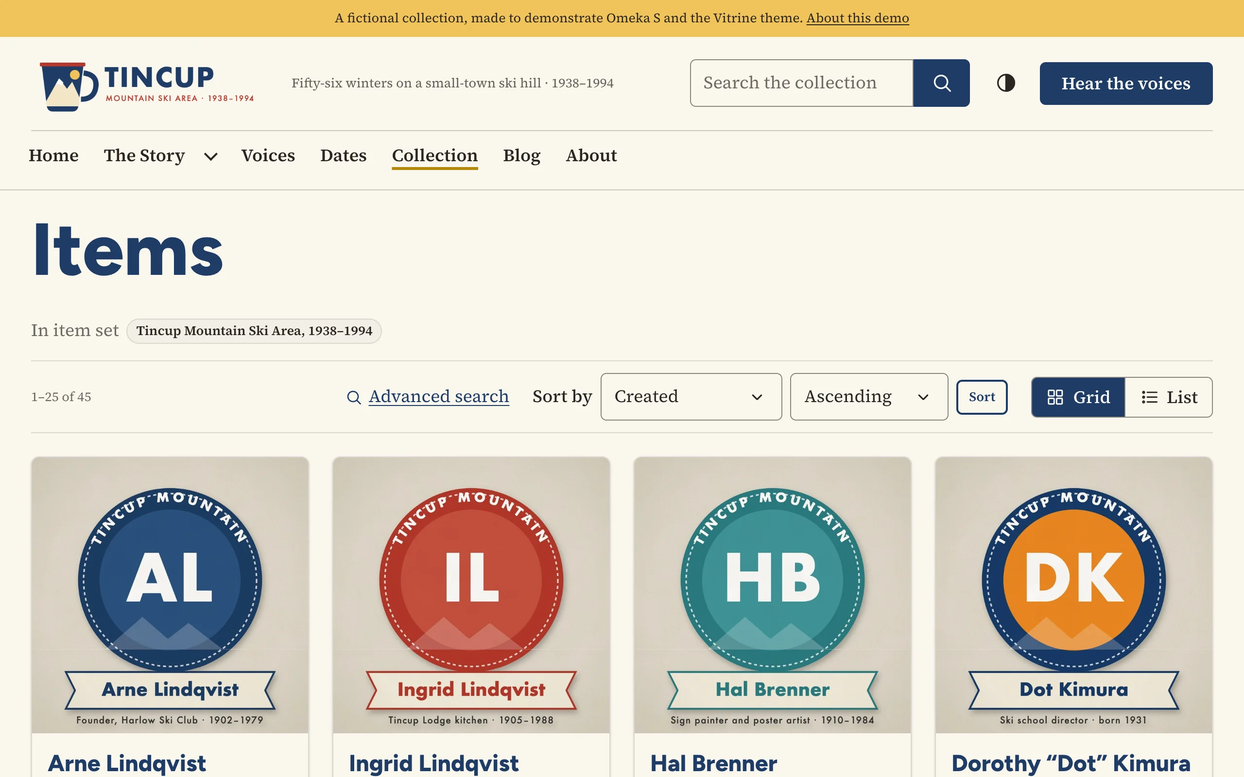
| Setting | Choices |
|---|---|
| Default layout | Grid of cards · List |
| Let visitors switch between grid and list | On by default. A visitor's choice is remembered. |
| Card style | Framed · Minimal (no frame) · Title over the image |
| Card image shape | Landscape (4:3) · Square · Portrait (3:4) · Wide (16:9) · Original proportions |
| Card image fit | Fill the frame (edges may be cropped) · Show the whole image |
| Card size | Automatic, or about 2, 3, 4 or 5 cards per row on a wide screen. Rows always reflow on smaller screens. |
| Description on cards | First three lines · First five lines · Full description · In list view only (three lines in list view, none in a grid) · Hidden |
| Line under the card title | Class and date ("Photograph · 1952") · Creator and date · Date only · Nothing |
The heading and description shown on cards follow the site's own browse settings (Site admin › Settings › Browse).
Item & media pages
| Setting | What it does |
|---|---|
| Page layout | Sidebar on the right · Sidebar on the left · Single column (sidebar below) |
| Shorten long value lists | Properties with more values than this show the first few and a "Show all" button. 0 always shows every value. |
What appears in each region of these pages is chosen under Theme › Configure resource pages. See Item and media pages.