Settings in Style preset, Colors and Dark mode.
Style presets
A preset supplies a value for every setting you leave blank or set to Use preset. Your own choices always win, so switching presets keeps them.
| Preset | Made for | Character | Fonts (headings / text) |
|---|---|---|---|
| Archive (default) | Libraries, archives, scholarly collections | Archival blue | Source Serif 4 / Atkinson Hyperlegible Next |
| Heritage | Museums, historical societies | Oxblood and green on cream, centered header | Fraunces / Lora |
| Civic | Public libraries, local government | Federal blue, navy header | Public Sans |
| Campus | Universities, special collections | Maroon header, bold headings | Inter / Source Serif 4 |
| Gallery | Art museums, photography | Black and white, image-forward, minimal header | Inter |
| Landmark | Parks, historic sites, nature centers | Forest green | Bitter / Figtree |
| Vivid | Community archives, nonprofits | Violet, pill buttons | Figtree |
| Nocturne | Film and photo archives | Always dark, brass accent | Playfair Display / Inter |
Colors
| Setting | What it does |
|---|---|
| Primary color | Your main brand color: buttons, links and highlights. |
| Secondary color | A supporting color: announcement bar, footer and secondary buttons. |
| Accent color | Used sparingly: highlights, badges, the active menu item. |
| Page background, Text color | The base colors of every page. |
| Link color | Primary, secondary, accent or text color. Links in text stay underlined. |
| Heading color | Text, primary or secondary color. |
| Guarantee readable contrast | On by default. Darkens or lightens a color only where text would fall below 4.5:1 (3:1 for borders and focus), keeping its hue. |
| Keyboard focus color | Based on the primary or the accent color. Always drawn with a contrasting halo. |
Enter colors as hex codes (#2d5f8b). Leave a color blank to use the preset's.
With Guarantee readable contrast on, the colors you see on the site may be slightly darker or lighter than the ones you entered, wherever that was needed for readability. The Style book page template shows the final colors and the contrast of every pair.
Dark mode
| Setting | Choices |
|---|---|
| Dark mode | Follow each visitor's device, with a light/dark switch · Light by default, with a switch · Always dark · Light only |
| Dark mode background | A color, or blank to derive one from your primary color. |
| Logo for dark mode | A light version of your logo for dark backgrounds. |
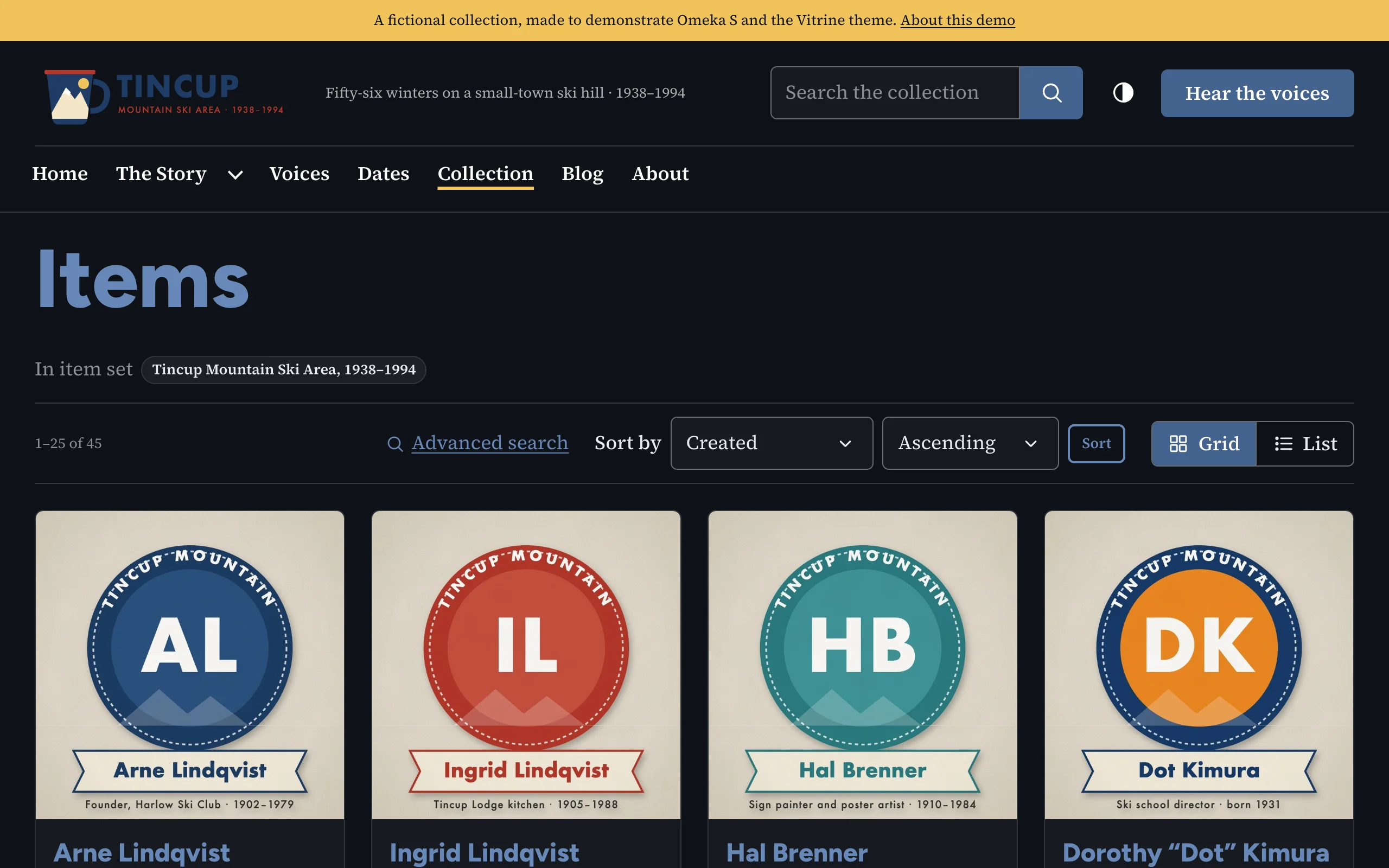
The dark scheme is generated from your colors and checked for contrast like the light one. A visitor's own choice of light or dark is remembered and applied before the page appears, so it never flashes the wrong colors.
Blocks with a background
In the page editor, a block or block group can have a background color or image (in its layout configuration). Vitrine computes readable text, link and heading colors for a background color, and lays a dark scrim under white text on a background image. See Block templates and sections.